This is about SAPUI5 main container controls.
You’ll learn:
- What each main container control is, such as shell, app, split app, view, page, semantic page, fragment, dialog
- When, where, and how to use each main container control
So if you want to know the differences between these container controls and how they work together, then this is the right place.
Let’s get started!
What Are SAPUI5 Main Container Controls?
It’s hard to tell at first what the differences are between the main container controls in SAPUI5 and when to use which.
The following are the SAPUI5 main container controls and when to use each one.
This is what the hierarchy of the main container controls looks like:
|— sap.m.Shell
|—— sap.m.App
|—— sap.m.SplitApp
|——— sap.ui.core.mvc.View
|———— sap.m.SplitContainer
|————— sap.m.Page
|————— sap.m.semantic.SemanticPage|
|————— sap.f.DynamicPage
|————— sap.f.semantic.SemanticPage
|—————— sap.ui.core.Fragment
|—————— sap.m.Dialog
For example, the App or SplitApp control goes into the Shell control, the View control in the App or SplitApp control, and so on.
Let’s kick things off with control #1:
SAPUI5 Shell Control
The sap.m.Shell control is the root of an SAPUI5 application.
Shell provides some functionality for SAPUI5 applications, such as setting a logo. It also does the visual adaptation of the application.
For instance, the Shell lets you limit the width of the content of an application—a feature called letterboxing. The shell’s appWidthLimited property is enabled by default and set to 1280px.
The letterbox width limitation affects only desktop views of an application. Because the purpose of this limitation is to preserve the original aspect ratio of the application for larger screens and therefore, doesn’t cause the content to become distorted or stretched when adjusting for larger screens.
However, the Shell control isn’t mandatory for an application.
SAPUI5 App Control
Either the sap.m.App or the sap.m.SplitApp control needs to be a part of an SAPUI5 application for two reasons:
- Each tweak the HTML in a way that makes it suitable for mobile apps.
- Each inherits from sap.m.NavContainer to provide navigation capabilities like navigation between pages and full-screen controls.
Furthermore, the App and SplitApp controls allow setting a background image for an entire application with the backgroundImage property.
The App control is not necessary for an SAPUI5 application to run, but it’s expected to be present in any application for the reasons stated above.
There is only one App or SplitApp control per SAPUI5 application.
However, the App control doesn’t add anything visually to an application out of the box; if you add it to an application, it will look like before.
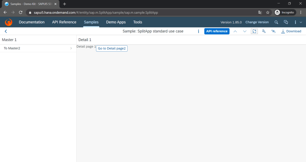
SAPUI5 Split App Control
The sap.m.SplitApp is just the same as sap.m.App except that it features two sap.m.NavContainer in the desktop and tablet mode—if it is running on a phone it has just as the sap.m.App one nav container control.
Each NavContainer has a container of its own—the SplitApp control splits the application into two containers:
- Master area
- Detail area
SAPUI5 Split Container Control
The sap.m.SplitContainer has the same features as the sap.m.SplitApp. The use case of a SplitContainer control is when a SAPUI5 application has as its root the sap.m.App, but it also needs to feature a master-detail view:
For example, the start page of the application should be a single site like a sap.m.App with a nested sap.ui.core.mvc.View and sap.m.Page. There’s a link on this page to another site of the application. And this site is supposed to have a master-detail view. Then this view contains a sap.m.SplitContainer:
|— sap.m.Shell
|—— sap.m.App
|——— sap.ui.core.mvc.View (site 1)
|———— sap.m.Page (site 1)
|——— sap.ui.core.mvc.View (site 2)
|———— sap.m.SplitContainer (site 2)
|————— sap.m.Page (site 2: master)
|————— sap.m.Page (site 2: detail)
The sap.m.SplitContainer looks exactly the same as the sap.m.SplitApp.
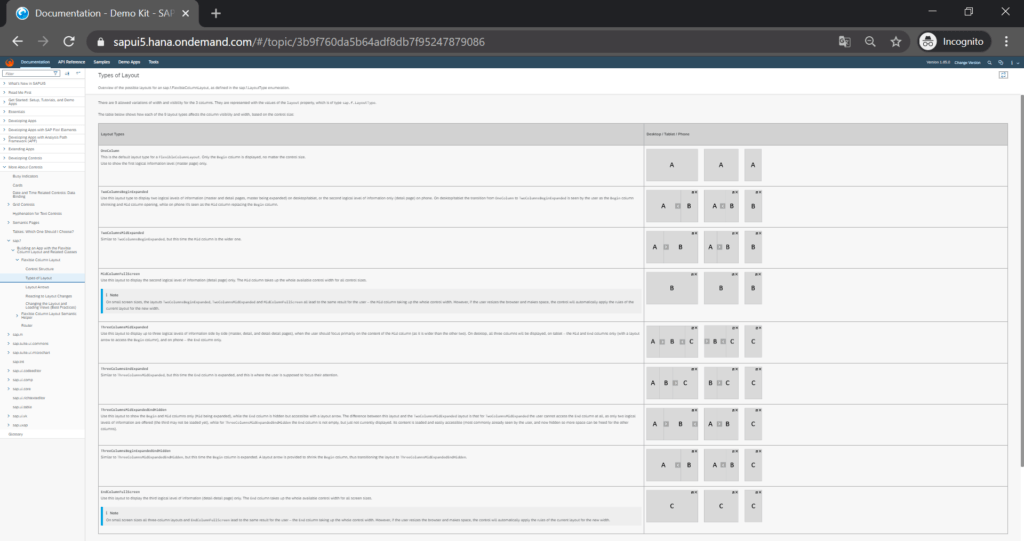
SAPUI5 Flexible Column Layout
The sap.f.FlexibleColumnLayout is similar to the split app container control but offers 3 columns instead of 2 columns. The width of the 3 columns is variable:
SAPUI5 View Control
The sap.ui.core.mvc.View does three things in particular:
- Connects itself to a controller and its content—such as for example, a sap.m.Page and its content inside of the View. Hence, the View is crucial in realizing the Model-View-Controller architecture in SAPUI5.
- Sets some basic visual appearances like width and height.
- Provides life cycle event hooks that can be used in a View’s controller:
- onInit
- onBeforeRendering
- onAfterRendering
- onExit.
A View control reflects a simple website or a section of a website. The sap.ui.core.mvc.View is the base class for its sub-views:
- sap.ui.core.mvc.HTMLView
- sap.ui.core.mvc.JSONView
- sap.ui.core.mvc.JSView
- sap.ui.core.mvc.XMLView
To use XML Views is best practice for SAPUI5.
The View control makes like the App control by default no visible adaption to an SAPUI5 application.
SAPUI5 Page Control
The sap.m.Page represents one screen or one site of an SAPUI5 application.
The Pagecontrol is usually the container control for all other non-container controls of a site: from a sap.m.Button, to a sap.ui.table.Table, to a sap.ui.comp.smartchart.SmartChart.
The page control has three sections to put other controls:
- Header
- Content
- Footer
The header section is the top area of a Page. The header contains a back navigation button and a title by default.
The content section is the main area of a Pagebetween the header and the footer. Only the content section is scrollable by default. The content section usually has the site’s main content.
The footer section is the bottom area of a Page. The footer is optional. It’s fixed to the bottom by default. On the other hand, it can be made to float above the content section using the floatingFooter property.
In the footer there are usually buttons like save and cancel.
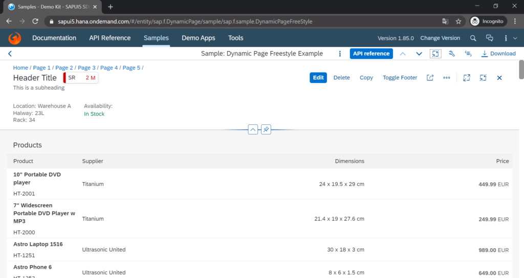
SAPUI5 Dynamic Page Control
The sap.f.DynamicPage has the same scope as the sap.m.Page. As well, a DynamicPage consists of three areas:
- Header
- Content
- Footer
The sap.f.DynamicPage is kind of the new version of the sap.m.Page. Almost all recent SAP Fiori applications use the DynamicPage instead of sap.m.Page.
The sap.m.Page exists since the first SAPUI5 release in 2013 and the sap.f.DynamicPage exists since the SAPUI5 version 1.46 release in 2017.
The sap.f.DynamicPage features a new design in comparison to the sap.m.Page such as a redesigned footer or a toggleable header.
The DynamicPage control is for titles that are always visible and headers that are collapsible and expandable. The Page control is recommended if the header toggle function is not needed since it is a lighter control than the DynamicPage.
But keep in mind that only the DynamicPage conforms to the newest SAP Fiori design guidelines:
SAPUI5 Semantic Page Control (Inhertis From sap.m.Page)
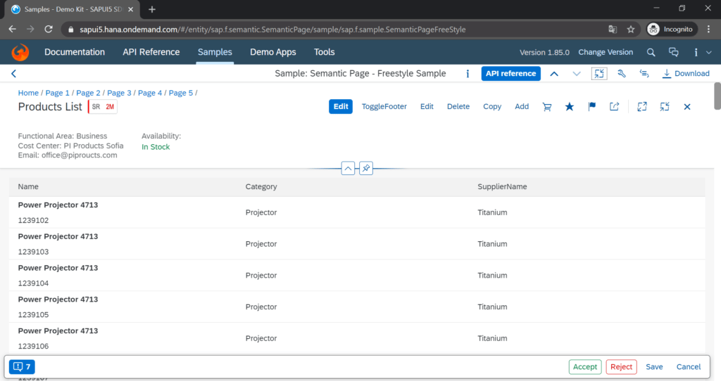
The sap.m.semantic.SemanticPage is an enhanced sap.m.Page; the difference here is the SemanticPage has semantic controls.
Semantic controls have a predefined placement, behavior, and style on a SemanticPage.
Therefore, the purpose of a SemanticPage is to provide consistent appearance over different sites and applications.
A SemanticPage automatically places semantic controls in dedicated sections of the footer or the header. You can put whatever you want in the content area:
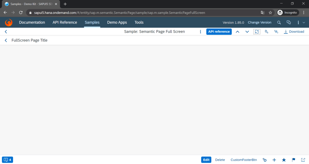
SAPUI5 SemanticPage Control (Inhertis From sap.f.DynamicPage)
The sap.f.semantic.SemanticPage is an enhanced sap.f.DynamicPage. Similar to what’s for the sap.m.semantic.SemanticPage and its relation to the sap.m.Page, but it’s relation is with the sap.f.DynamicPage instead.
The obvious difference between the sap.m.semantic.SemanticPage and the sap.f.semantic.SemanticPage is that the sap.f.semantic.SemanticPage looks like a sap.f.DynamicPage whereas the sap.m.semantic.SemanticPage looks like a sap.m.Page. Who would have thought.
Another difference is that the sap.m.semantic.SemanticPage uses the SAP Fiori 1.0 design guidelines and the sap.f.semantic.SemanticPage uses the SAP Fiori 2.0 design guidelines. Same what goes for the sap.m.Page and the sap.f.DynamicPage:
SAPUI5 Fragment Control
The sap.ui.core.Fragment is like a sap.ui.core.mvc.View except that it doesn’t have a controller by itself. Fragments are nested into Views and therefore, they can use the controllers of their View.
In other words, a Fragment is its own container inside a View container, but it uses the View’s controller.
Fragment can be defined in different formats just like a View:
- HTML
- JS
- JSON
- XML
Fragments have the following use cases:
- Modularization of the user interface without fragmenting controllers
- Declarative definition for views
- Reusing user interface parts
For example, an SAPUI5 application uses a table across multiple sites. That table would go in a Fragment. The Fragment would go into each View of each site where the table is supposed to be. That would be a reuse of a table’s user interface.
Instead of copying and pasting the table, it’s much easier to define the table once in a Fragment and then integrate it into each View using just a few lines of code.
Fragments don’t have any visual effects by default.
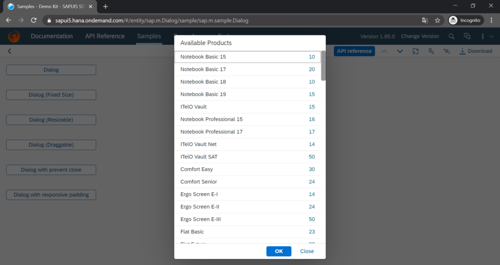
SAPUI5 Dialog Control
The sap.m.Dialog is at the bottom of the SAPUI5 container control hierarchy: a Dialog usually goes inside a Page, but it can also be put inside a Fragment.
The Dialog is a pop-up window that holds whatever you put inside. It displays its content without reloading the entire site.
Dialog is best for:
- Display a message that needs user input like okay or cancel
- Interrupt a user action
- Show value helpers
- Show messages with a description
- Display additional content without reloading the site